// Michael T. Bradley

Senior UX Designer

& Researcher   Strategist   Visionary   Game Designer   A.I. Developer   Business Analyst  

// Biography

Born in the city of Detroit, Michigan, my journey began amidst the urban rhythm and industrial pulse of the Motor City. Soon, my family relocated to the Bay Area, California, where I spent my formative years exploring the eclectic blend of cultures and innovation that defines the region.

Growing up in the Bay Area, with its technological prowess and cultural diversity, ignited my curiosity and passion for design. High school days in Dublin, California, provided the backdrop for my early education, laying the groundwork for the academic path that lay ahead.

// Personal Details
  • Name: Michael T. Bradley
  • Address: Wilseyville, CA 95257
  • Study: University of Phoenix
  • Degree: Bachelor's of Science, Business Management
  • Contact: LinkedIn
  • Freelance: Available
// Design Skills
Figma96%
Sketch96%
Photoshop80%
Inkscape64%
// Programming Skills
HTML / CSS96%
GDScript80%
JavaScript72%
Python64%
// Interests
  • Game Design & Development
  • Web3 Design & Development
  • Natural Language Processing
  • A.I., M.L., & Neural Networks
  • Indie Wargame / RPGs
// Education
  • Udemy A.I. & Machine Learning,
    Data Science Bootcamp

    Certificate of Completion
    2023 - 2024
  • Academy of Art University, SF

    Web Design / New Media
    2009 - 2013
  • W3Schools Web Development
    Certificate of Completion

    Web Design & Development
    June 2008
  • University of Phoenix
    B.A. Business Management

    Web Design & Development
    June 2006
// Experience
  • Calaveras County Superior Court

    Business Analyst
    Current
  • Capital One

    Senior UX Designer
    May - November 2022
  • Walmart eCommerce

    UX Designer
    2018 - 2021
  • eBay

    UX Designer
    2017 - 2018
  • Google

    UX Designer
    July - December 2016
  • Freelance

    Design & Developer
    Concurrent
// Fun Facts
  • 200+

    Projects Completed
  • 45k+

    Lines of Code
  • 300+

    Tacos Eaten
  • 100%

    Savvy Designer
// Professional Experience Partners
  • 1
  • 2
  • 3
  • 4
  • 5
  • 1
  • 2
  • 3
  • 4
// Accolades
// Skills
  • Creative Design

    • Figma Design
    • Photoshop Design
    • Sketch Design
  • Web Development

    • Web3 Websites
    • Game Websites
    • NFT & AI Websites
  • Mobile Application

    • Android Design
    • IOS Design
    • Agnostic Design
  • Research

    • User Testing
    • Prototyping
    • Journey Mapping
  • Leadership

    • Communication
    • Project Management
    • Problem Solving
  • Artificial Intelligence

    • Machine Learning
    • NLP Models
    • Prompt Engineering
// Creative Portfolio
// Case Studies
  • 1. Meeting Customer Needs

    Client: Capital One
    Business: Unified Repayments
    Team: Manager, Product, Developers
    Manager: Amy Chick
    Role: Lead Sr. UX Designer
    Tools: Figma, Mural


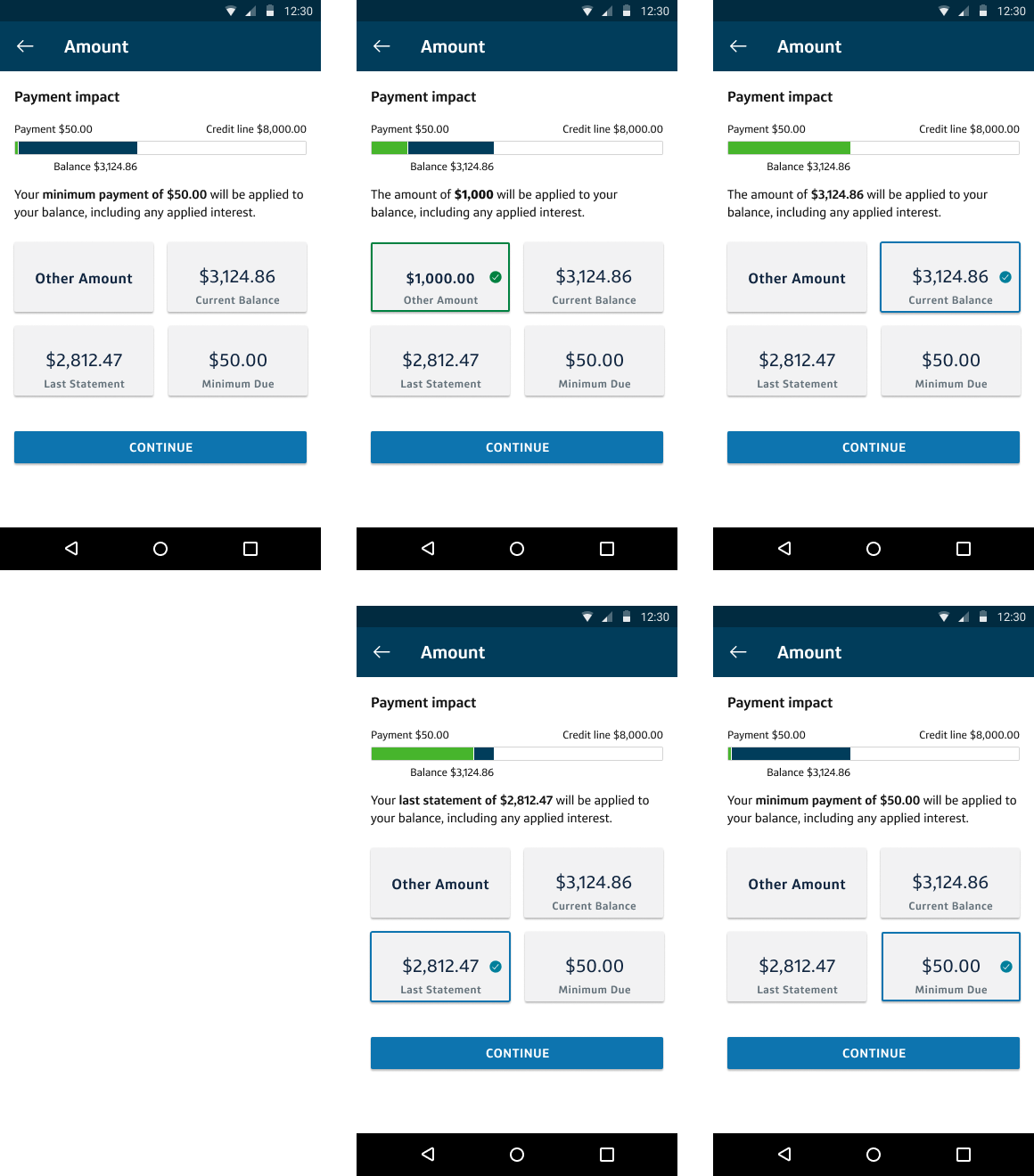
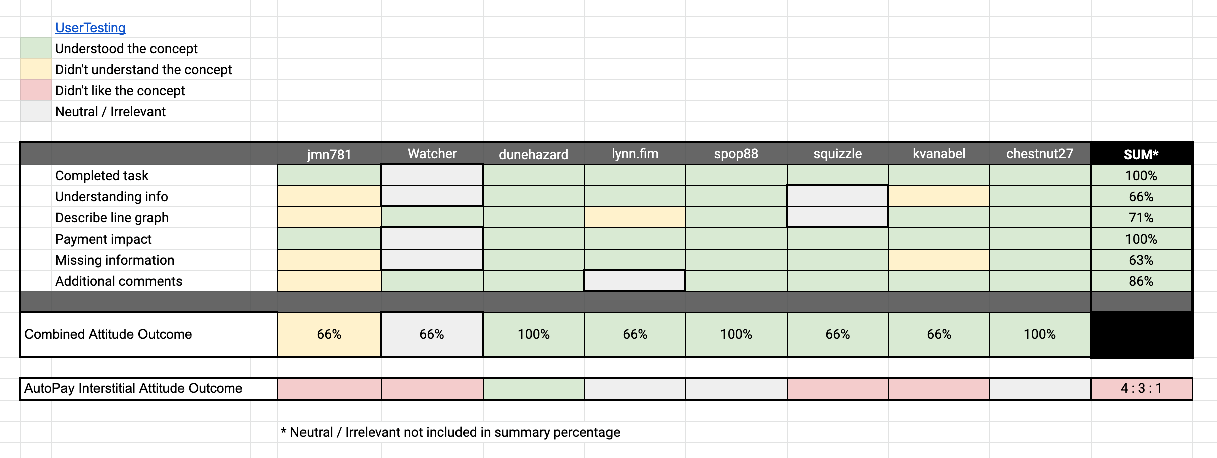
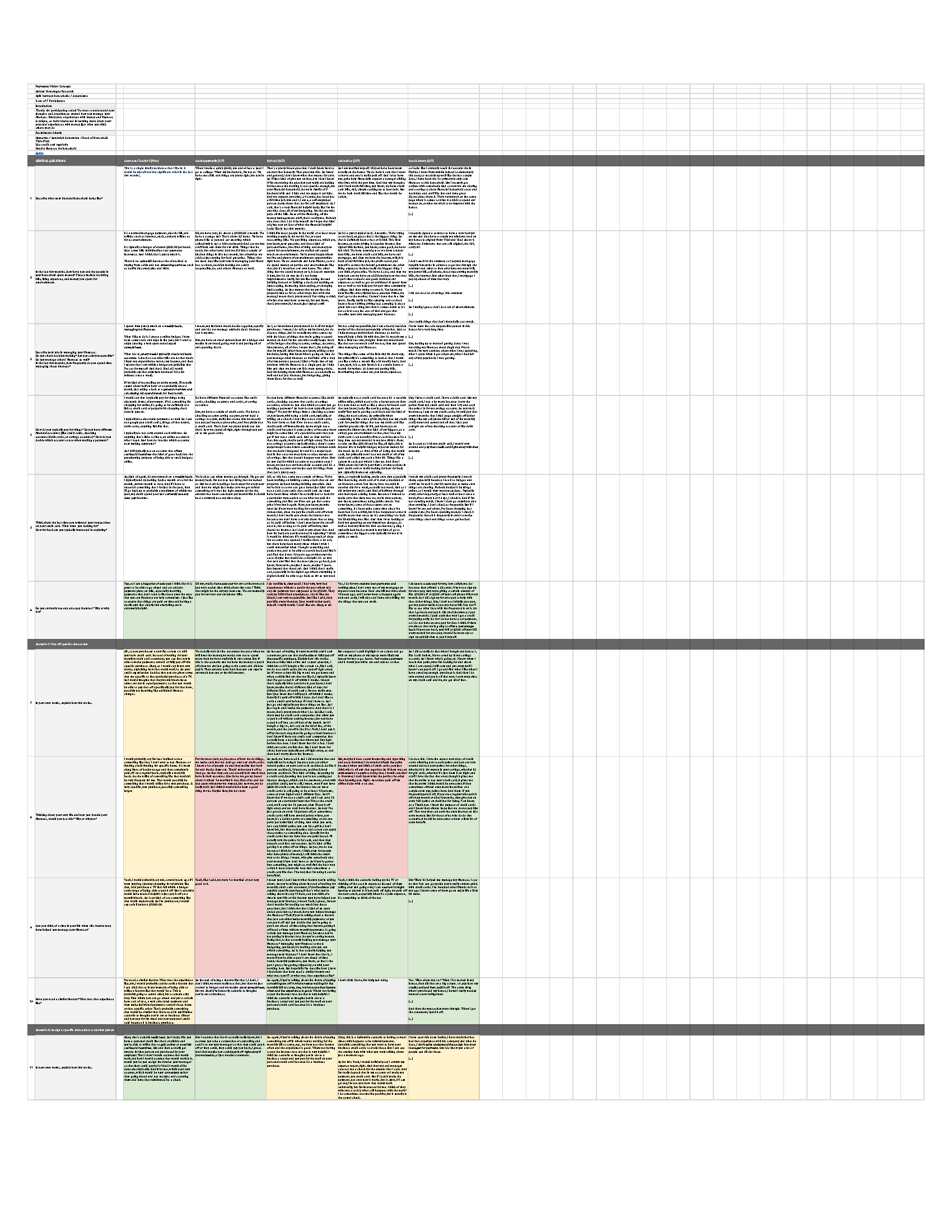
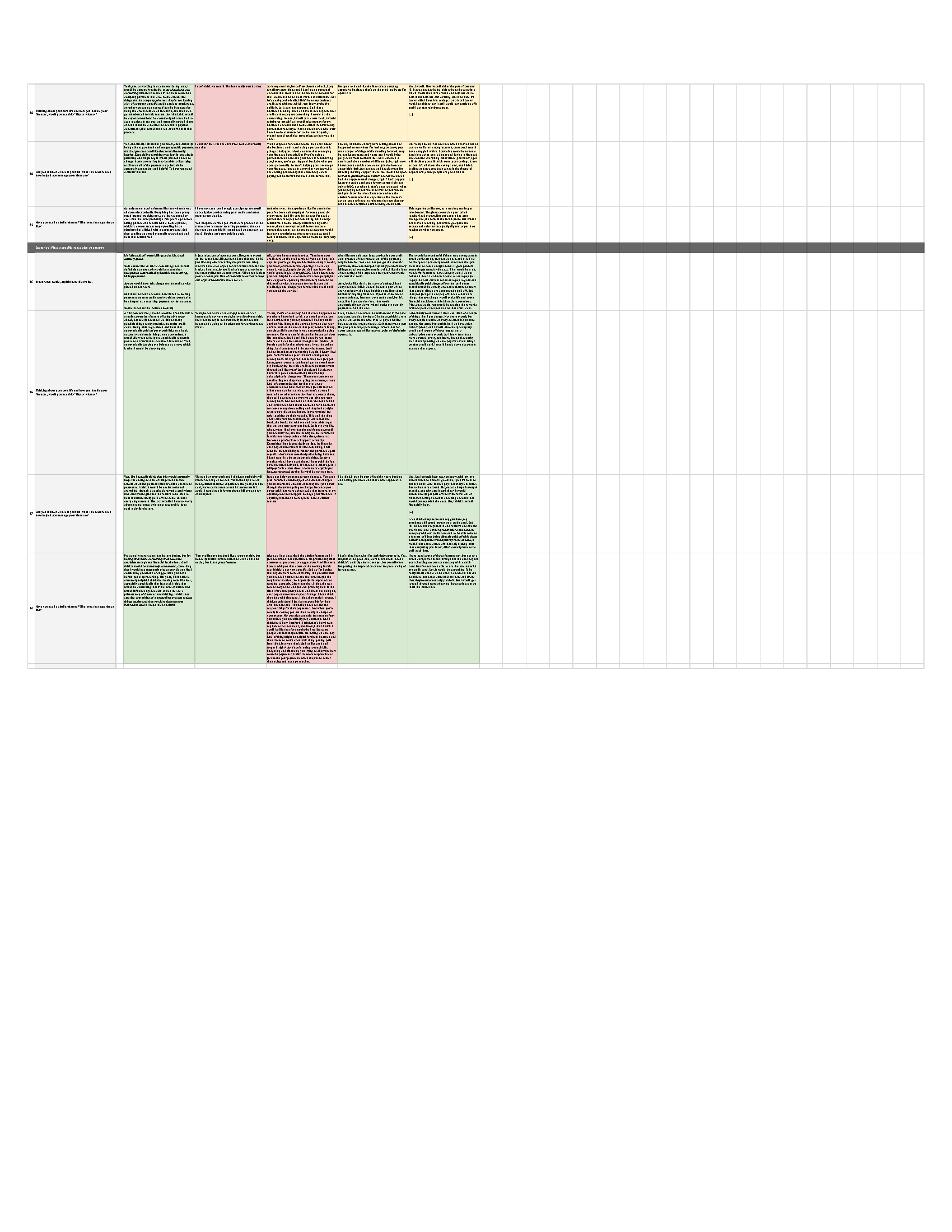
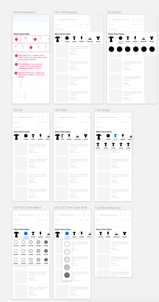
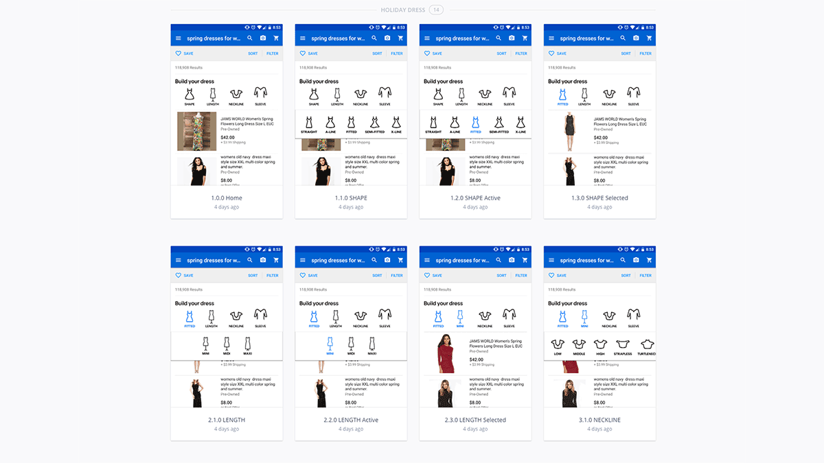
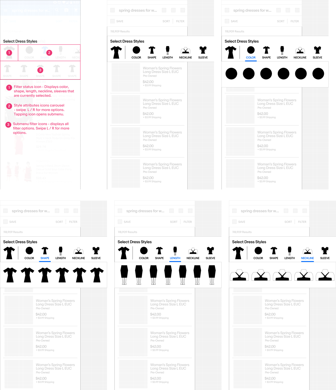
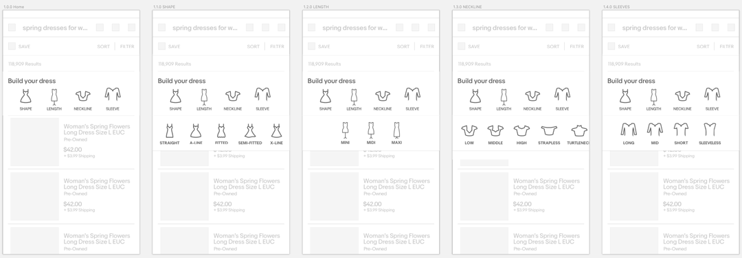
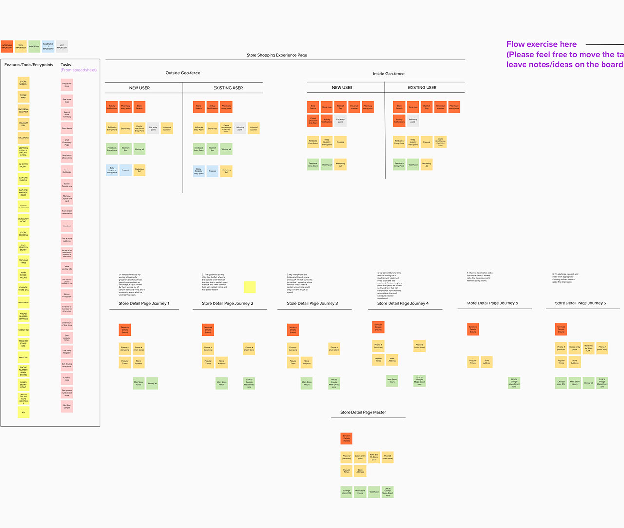
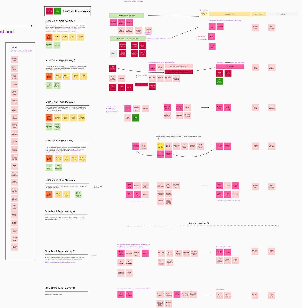
    Joining the Capital One repayments team was one of the best professional experiences I've ever had. My manager, Amy, is a true leader, and inspired me to bring my A game to the table. We were a light, dynamic and intelligent group, consisting of Product, Content and UX.

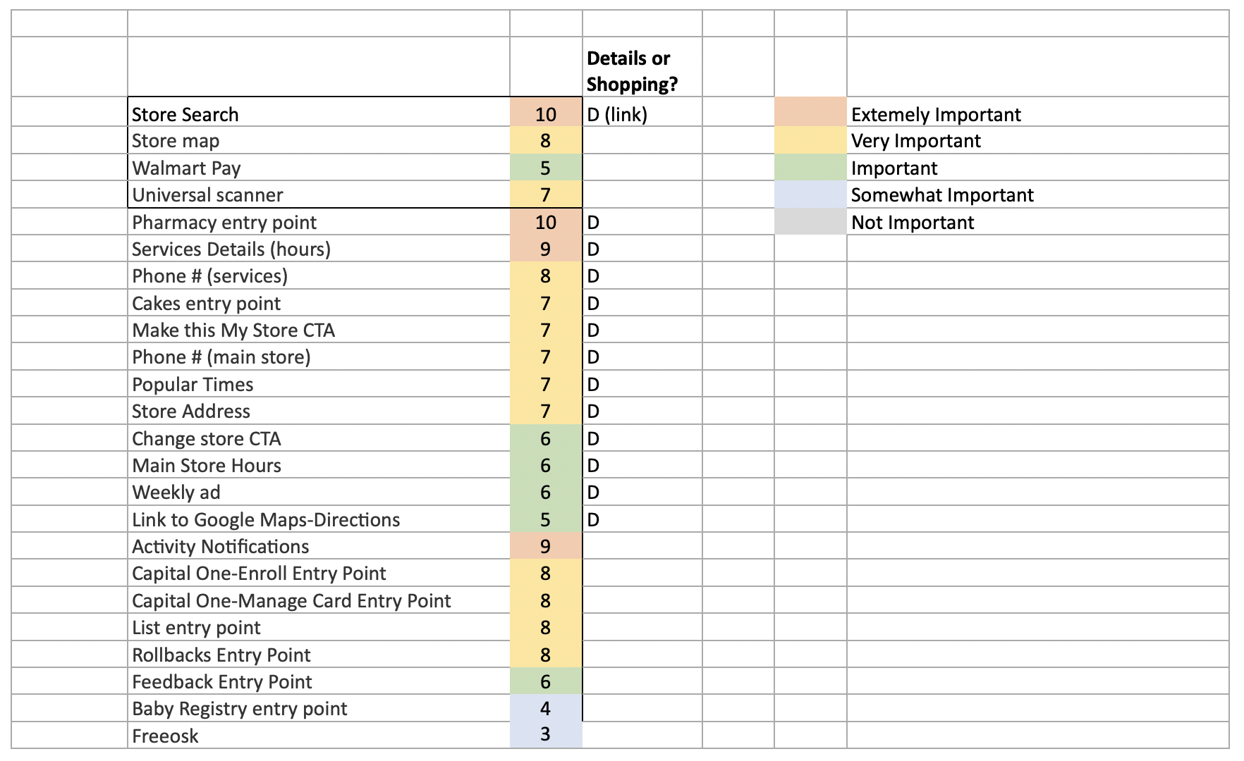
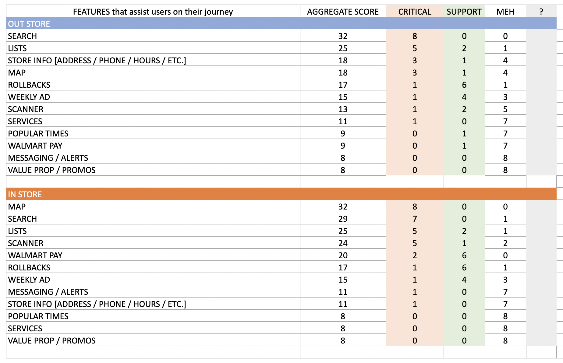
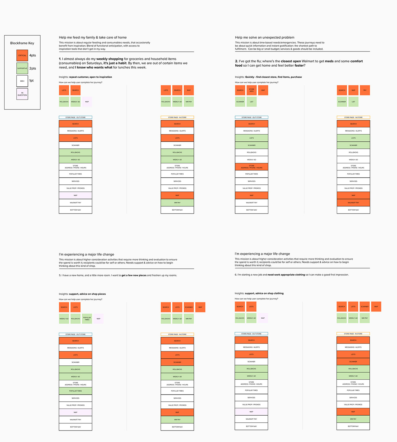
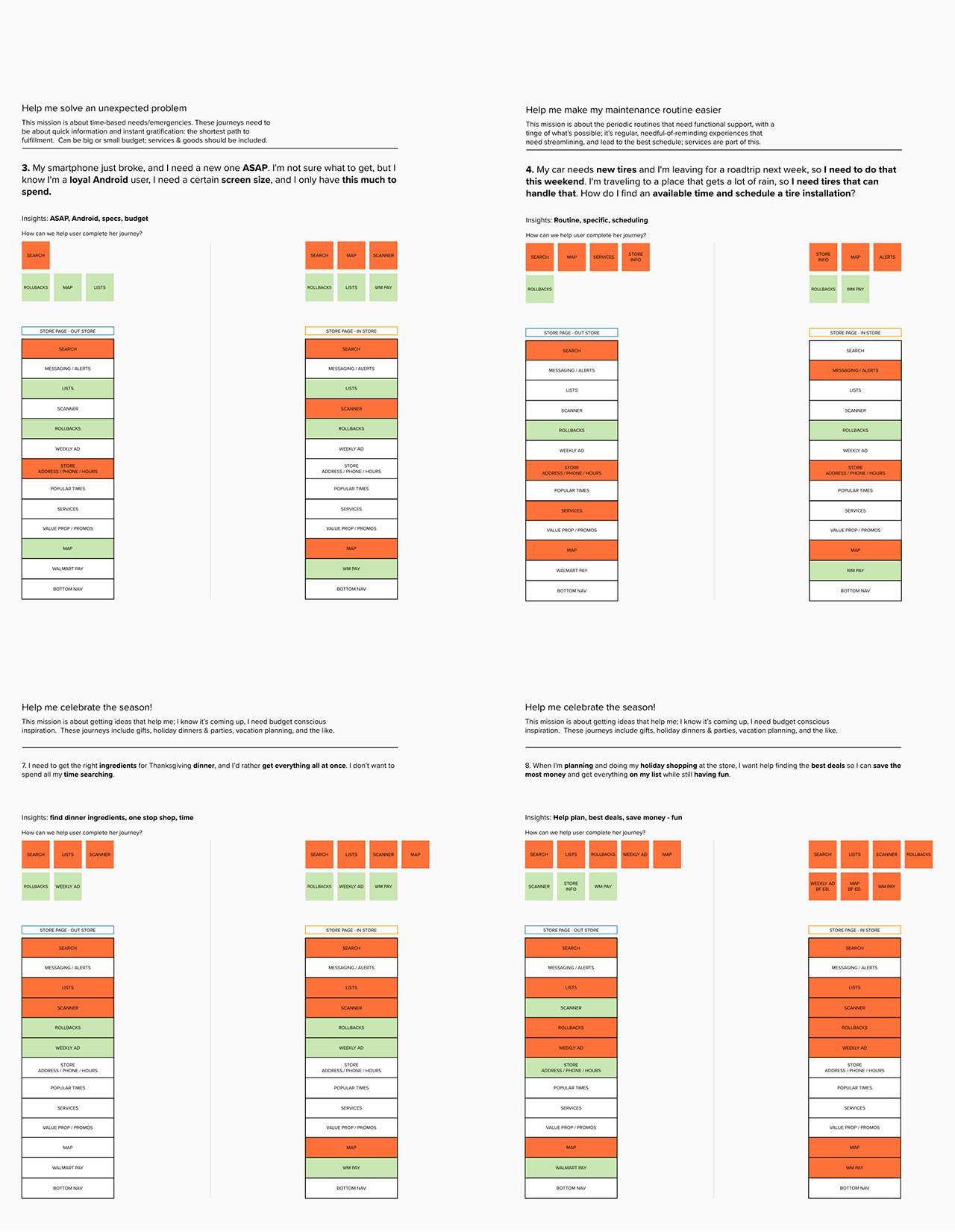
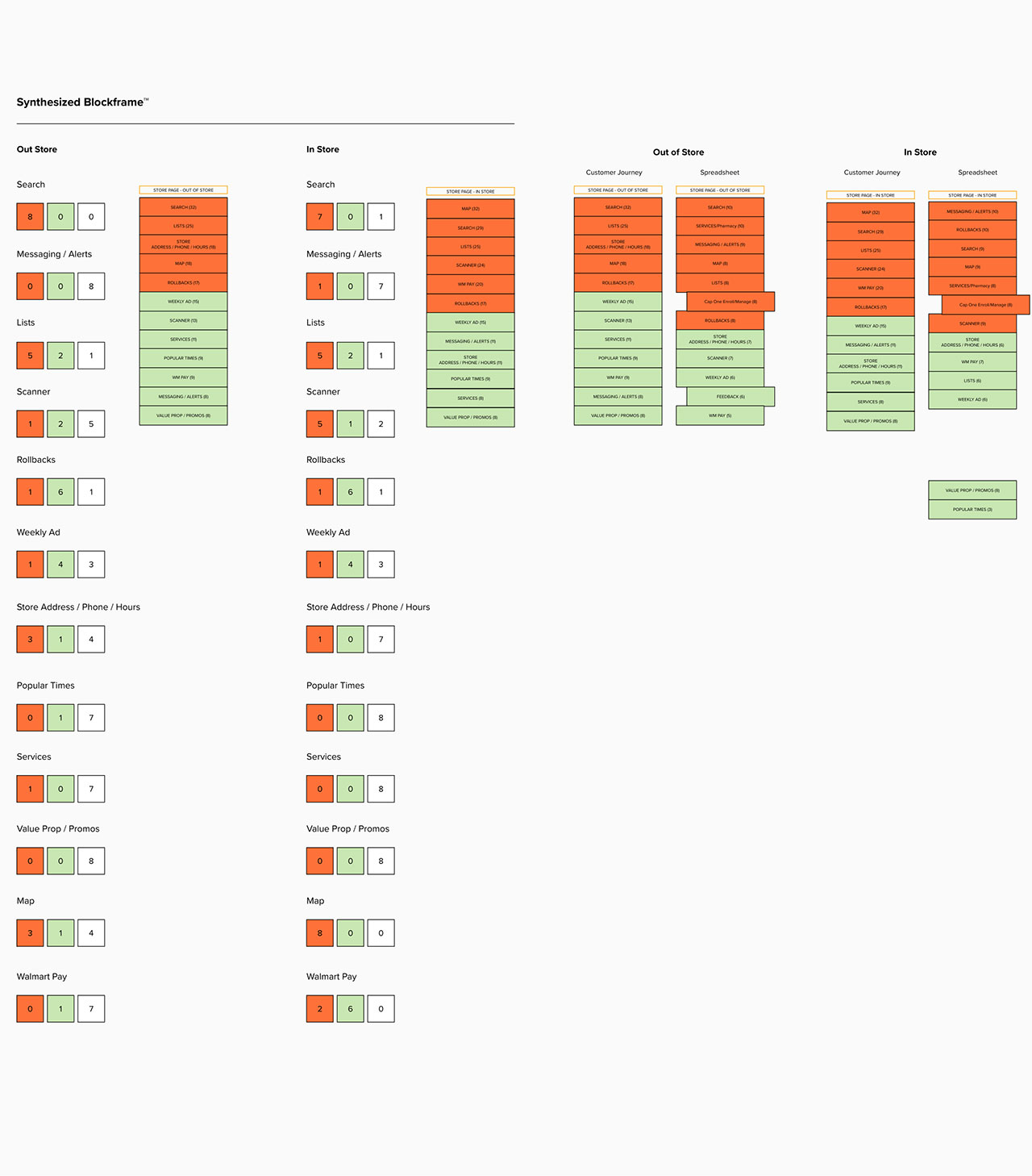
    Our challenge was to bring Capital One into a leadership position with its competition in the digital repayments space. Recent data had shown that we were not meeting customer expectations.

    The research team had done preliminary customer research, which we used as the source-of-truth, the foundation in which we began our journey.

    2. Discovery

    Working closely with the Product team, we began the divergent journey into the Discovery phase of the design process. We created a whiteboard, and here thought around research discoveries, documenting anything relevant to the task at hand.

    3. Problem Spaces

    The team began to orbit around three problem spaces.

    • Conflicting Financial Goals
    • Neurodivergent Needs
    • Changing Shape of Households

    4. Changing Shape of Households

    Taking a deep dive into the humans and their needs, the changing shape of households idea began to gain traction.

    The Nuclear Family structure is often considered the traditional or conventional family model, though research has shown that this is not as prevalent in modern times as people would believe. The shape of the household has indeed changed.

    Modern household types:

    • Nuclear Household (22%)
    • Boomerang Household (52% Millennials)
    • Extended Family
    • Sandwich Household / Multigen
    • Unrelated / Roommates Household

    5. Hierarchy of Needs

    I associated Maslow’s hierarchy of needs with what our Research team discovered in their preliminary findings. Indeed there was a correlation between the two. With that, we agreed we were on the correct path of discovery as we try to define our problem.

    6. Defining the Problem

    The State of Spending research has shown that, “We don’t recognize the emotional transaction” - Carol Glover

    We set out to create a payments experience using actionable data and insights to provide transparency in moments that matter and proactively offer personalized, flexible solutions that help customers confidently make decisions across their entire financial ecosystem.

    So, what is the emotional transaction in these modern households? We began to explore those user journeys.

    7. Storyboards

    Riley has just graduated from college and landed her first full-time job, and now receives a consistent paycheck. This is the first time she has to manage her finances, independent of her parents.

    8. Hypothesis

    Our hypothesis statement was: Data visualization will encourage more informed decision making when it comes to payments. The questions to explore:

    • Does data viz help influence the payments decisions customers make?
    • Does data viz help customers with spend management?
    • Does this approach to content increase comprehension of payment impacts over our static descriptions?

    Initial approaches to data viz should be clear to users and intuitive to use. Ultimately, phases of data viz need to clearly illustrate payment impact for our in-market customers.

    9. Guided Monologue Research

    Within the one-time payments experience, customers are given numerous payment options—but the experience is lacking the contextual relevance that would enable them to make more informed payments decisions. An initial redesign in payments options manager (POM) will include interactive data viz to show the impact of the various payment options on a customer’s credit balance.

    Unmoderated prototype tests were conducted via Usertesting.com

    10. Research Results

    We started with one group of 8 participants. There was one prototype and the same set of questions/tasks for each participant. We recruited active credit card holders/users responsible for making payments toward their balance.

    I went through each video, documenting participants feedback and compiling them into excel spreadsheets for synthesizing. The colors represent the overall feeling / feedback from the participant.

    11. Key Findings

    Participants understood the data visualization component, and some expected it. Comprehension was high, and participants understood the impact of their payment based on the different option selected in the prototype.

    Participants said the data viz component would motivate them to pay more. Explicitly seeing payment impact and removing the need for mental math could encourage in-market customers to make higher payments as a result, lowering float cost and potentially the number of revolving accounts Month-to-month.

    Aditionally, Participants want to see interest owed in the data viz component. As noted in the initial round of research, participants want to see how much interest they’re responsible for paying, and how their payments decisions impact interest owed.

    12. Visual Design

    I worked with the Design Language team to design the data visualization component to not only suit our needs, but also in a way that it could be leveraged by the larger design group, and be added to the library as a universal component.

    13. In Conclusion

    In conclusion, we Discovered what the customers goals were and Defined what their challenges are. We Designed and conducted user research (twice!) to validate our hypothesis. Finalized the visual design, and gained approvals from our stakeholders, including Product and Engineering teams. Then Delivered to said teams for launch!

    Unfortunately, shortly after handoff, budget cuts resulted in termination of contractors, of which I was one.

    In retrospect, my experience was one of text book UX process, as well as meeting some of the best and brightest people. It was truly a heartbreak to leave such great people, but I am thankful for the experience.

    “Michael Bradley, your humility and growth mindset are among your best qualities. Thank you for fighting every day for a better customer experience, and your willingness to be vulnerable.” - Amy Chick, Payments Team Lead & UX Manager.

  • 1. Next Bank Prototype

    Client: Captial One
    Vertical: Payments
    Hypothesis: Data viz will encourage more informed decision making when it comes to payments.

    Capital One aspires to build a payments experience that helps customers make more informed decisions about their finances. Given the flexibility of payments options manager (POM), the one-time payments flow provides a good space to explore what a more impactful experience could look like.

    Specifically, within the one-time payments experience, customers are given numerous payment options—but the experience is lacking the contextual relevance that would enable them to make more informed payments decisions. An initial redesign in POM will include interactive data viz to show the impact of the various payment options on a customer’s credit balance.


  • 1. Emergency: COVID-19 Pandemic!

    Client: Walmart eComm
    Business: Customer Returns
    Team: Manager, Product, Developers
    Manager: Michael DeSilva
    Role: Lead Sr. UX Designer
    Tools: Sketch, InVision, Mural, Photoshop, Protopie


    On Monday morning following the mandated lockdown, our business partners in India opened the day with an urgent conference call, painting a vivid picture of the challenge at hand. The mission was clear: devise a contactless solution for in-store returns, and we had just one week to make it happen. In their possession was a raw slideshow, a visual sketch of their initial thoughts, serving as the starting point for our solution.

    One of the key design mandates was to leverage existing technology, and considering its widespread availability, the mobile web became our designated platform. The solution needed to be up and running within a week, and that was the lowest level of effort for the developers.

    2. Define the Project and Objectives

    In response to the imperative of minimizing contact between customers and associates during the challenging operational circumstances imposed by pandemic restrictions, our focus turned to the profound impact on the operational landscape of numerous stores.

    In this critical scenario, the urgency arose to formulate a comprehensive solution facilitating in-store returns for customers, ensuring strict adherence to mandated guidelines. The goal was not only to address the pressing need for returns but also to strategically negate any potential delays that could compromise the safety and well-being of both customers and associates.

    We defined our challenge as the question, how do we negate / minimize contact between customers and associates?

    3. Define User Scenario

    Meet Sarah, a non-tech-savvy customer who recently made a purchase from her favorite store. Realizing that the item doesn't quite meet her expectations, she decides to return it. Though not tech-savvy, Sarah discovers that her store offers a convenient in-app return process.

    Using her mobile app, she effortlessly navigates to the 'Return' section, where she finds a user-friendly interface guiding her through the process. Following the prompts, she selects the item, provides a brief reason for the return, and schedules a return date. The app generates a QR code for her return.

    Feeling accomplished, Sarah heads to the store. Upon arrival, she approaches the designated return counter. The store staff, equipped with a mobile device, scans the QR code from Sarah's app, instantly retrieving details about her purchase. Sarah hands over the item, and the return is processed seamlessly.

    The staff confirms the refund, and within moments, Sarah receives a notification on her app acknowledging the successful return and initiating the refund process. The entire experience, from setting up the return in-app to completing it in-store, proves hassle-free for Sarah, showcasing the power of a user-friendly and efficient return process.

    4. Identify User Flows

    Mapping out user flows, we had to identify where opportunities and gaps were to achieve our goal.

    5. Wireframing

    Wireframing user flows early in the UX process is crucial.

    It provides a visual blueprint that helps stakeholders, including designers and developers, to understand the intended user journey and interactions with the product. This clarity aids in aligning the team's vision and goals from the outset.

    In our case, time was crucial. Thus, we skipped wireframing because we were iterating on an existing experience, and modifying it to our current requirements.

    6. Prototyping

    Prototyping plays a pivotal role in the UX design process as a dynamic tool for gaining invaluable user insights and feedback. By creating interactive and tangible representations of the design concepts, prototypes allow users to experience the product's functionality and flow firsthand.

    7. Visual Design

    Because there was nothing net-new, the visual design adheared to Walmart brand guidelines.

    8. Usability Testing

    We had three tenants while creating our research script:

    • Don’t break it!
    • Did the user understand it?
    • Did it bring value to the user?

    9. Collaborate with Development Team

    Designing in parallel with the development team, especially with tight turnaround times, demands seamless collaboration and communication.

    The synergy between developers and I became paramount as both teams worked concurrently to bring this concept to fruition. Close collaboration ensures that design decisions align with the technical feasibility and constraints of the development process.

    The biggest challenge developers had to solve was to use the camera on mobile web to scan the QR code. It hadn't been done before, and they did it!

    10. Launch and Monitor

    I finalized all designs, handed off to the developers (who pretty much had it done already!) and we launched!

    What did we accomplish?

    • We were able to get out the MVP out the door in couple weeks.
    • We tested the prototype with real users to get quick feedback.
    • We adjusted and refined our design based on that feedback.
    • As a designer, I was able to push the dev team to implement mobile web scan.
    • We saw quick adoption and successful customers usage.
    • We launched an MVP to further monitor and iterate upon.

    As with everything in a professional environment, teamwork was the only way we were able to acheive such an important task and reach out goals.

  • 1. Two Walmart Apps Combined

    Client: Walmart eComm
    Business: Digital Stores
    Team: Manager, Developers, Designers
    Manager: Monique Teselle
    Role: UX Designer


    Our UX design team faced a compelling challenge in merging two distinct applications—one tailored for Walmart Grocery and the other designed for Walmart eCommerce. Integrating these two platforms requires a delicate balance between preserving the unique user experiences of each while ensuring a seamless and cohesive transition for users navigating between grocery and general eCommerce services.

    Our task was to create a unified, intuitive experince that harmonizes the distinct functionalities of both applications, ensuring a smooth and efficient user journey. Balancing the specific requirements of Walmart Grocery with the broader scope of Walmart eCommerce demands thoughtful consideration of user workflows, design elements, and overall usability.

    Our challenge lay in crafting a consolidated, user-friendly experience that enhances the efficiency and convenience for users engaged in both grocery and general eCommerce activities within the Walmart ecosystem.

    2. Define the Project Objectives

    The primary project objective was combining the two Walmart apps for Grocery and eCommerce involve creating a unified and streamlined user experience.

    Our goal was to seamlessly integrate the functionalities of both applications, allowing users to transition effortlessly between grocery shopping and general eCommerce activities. This merger aims to enhance user convenience by consolidating shopping carts, order histories, and preferences across the two domains. We strive to optimize the overall user journey, ensuring a cohesive and intuitive interface that simplifies navigation and boosts overall efficiency.

    Additionally, the project seeks to maintain the unique features and branding of each app while establishing a cohesive design language that unifies the Walmart shopping experience. Through careful integration and thoughtful design, we aim to deliver a consolidated platform that provides users with a comprehensive and seamless shopping experience across Walmart's Grocery and eCommerce verticals.

    3. Customer Research

    In our quest to enhance user experience, we diligently reviewed existing customer research to gain a profound understanding of diverse customer needs across various journeys. Through in-depth analysis of distinct customer journeys, we aim to unravel the nuanced differences in their goals and expectations.

    By delving into these unique paths, we can identify specific pain points, preferences, and motivations that shape user interactions with our products or services. This comprehensive approach allows us to tailor our design strategies to cater to the specific needs and aspirations of users along different journeys, ensuring a personalized and impactful experience.

    The insights garnered from this customer research not only inform our design decisions but also enable us to proactively address user needs, ultimately contributing to a more responsive and user-centric product or service.

    4. In-store User Experience

    The in-store digital experience caters to customers based on their geofence status and login status. For customers within the geofence who are logged in, a personalized and location-aware experience awaits.

    They gain access to exclusive features such as real-time promotions, tailored recommendations, and in-store navigation assistance. The geofence enhances their engagement, offering a seamless blend of online and in-store services.

    On the other hand, customers outside the geofence, even if logged in, receive a more generalized digital experience. While they can explore product offerings and access essential information, the absence of geofence-specific features limits the personalization of their journey.

    This strategic differentiation ensures that customers, whether within or outside the geofence, receive a digital experience tailored to their context and preferences, fostering a more meaningful and relevant interaction with our brand.

    5. Information Architecture

    In crafting the information architecture for our application, we are strategically aligning features with user goals, drawing insights from comprehensive customer research. Utilizing the t-shirt sizing technique, we assign priority levels to application features based on their significance in supporting users' overarching goals. This method allows us to categorize features into essential, impactful, and supplementary tiers, ensuring a prioritized and streamlined user experience.

    By understanding the varying importance of features through this sizing approach, we can create an information architecture that places emphasis on elements crucial to users' success, facilitating a more intuitive and efficient interaction with our application.

    This user-centric design strategy not only optimizes the user journey but also ensures that the application aligns seamlessly with the diverse needs and priorities identified through meticulous customer research.

    6. Wireframing

    In the process of bringing the proposed customer experience to life, wireframing plays a pivotal role in visualizing and refining the design.

    Our wireframing approach focuses on outlining the essential elements of the digital journey, ensuring a clear representation of the user interface and interactions. By strategically mapping out key features and content placements, we aim to establish an intuitive flow that aligns with user goals. Through wireframing, we can iteratively refine the layout, functionality, and navigation, ensuring a seamless and user-friendly experience.

    This foundational step allows for collaboration and feedback, enabling the team to fine-tune the customer journey before moving into the more detailed phases of design and development. Ultimately, wireframing serves as a crucial blueprint, guiding the creation of a digital experience that not only meets but exceeds customer expectations.

    7. Prototyping

    Following a thorough review of the wireframes by our team, the next crucial step in our design process involves creating a prototype. Prototyping is indispensable as it transforms static wireframes into interactive and dynamic representations of the proposed customer experience.

    This iterative approach allows us to validate the functionality, flow, and user interactions, offering a tangible preview of the final product. By simulating the user journey, we can identify potential pain points, gather valuable feedback, and make informed refinements before advancing to full-scale development.

    Prototyping serves as a powerful tool for collaboration, enabling effective communication among team members and stakeholders. It bridges the gap between design concepts and the end-user experience, fostering a clearer understanding of the product's functionality.

    This process ensures that the final design aligns seamlessly with user expectations, making prototyping an integral step in delivering a polished and user-centric digital solution.

    8. Project Conclusion

    The team's collective effort was met with positive acclaim from leadership, underscoring the success of our collaborative approach and the quality of our design work. Our ability to function as a cohesive unit, leveraging diverse skill sets and perspectives, contributed to the positive reception. Unfortunately, the project was not completed by us.

    Despite the team's dissolution, my experience has proven to be a positive experience. The great team dynamic cultivated in the previous group has been instrumental in adapting to new challenges. The collaborative spirit not only fostered creativity but also promoted a supportive environment where ideas flourished.

  • Nameless Souls of the Void uses a Large Language Model (LLM), specifically Phi 2.Q4 provided by LLM for Unity by Undream AI., which runs locally without internet access. No data ever leaves the game. That means the file size will be large.

    There are four personality types, based on The Myers-Briggs Type Indicator (MBTI) psychological assessment tool. I intend to add more.

    I have no idea what The Nameless will say, so ... be warned! I did try to put some guard rails to keep the conversation relevant...but in early testing, they didn't always work. Any feedback you may have on how the model performs would be fantastic. My contact is the game, or reach out to me here.

    Controls are standard WASD (and arrows). SPACE BAR will move you forward. Look around, find a soul and crash into it to start the conversation of redemption.

    Cheaters notes:

    • The LLM will (should!) respond to "I forgive you", or something to that effect.
    • If the LLM responds with "soul is saved", it should move on and give you a point.
    • If it does NOT say something about its soul being saved - try to make it say the words!
    • on MacOS, it will ask for access because the LLM is stored locally, not on the interwebs.
    • Did not test on Windows. Good luck with that.

    This is a proof-of-concept, in early access to gather feedback, suggestions and performance of the LLM. Credits for music, images, etc. in-game.


    Nameless Souls of the Void


  • Galactic Pioneers: Expedition in development! A Web3 browser based space ARPG! Each NFT is a starship to play and level up! Polygon NFT starships are now available at OpenSea to support development.

    The goal is to create an EVE-offline-light, Star Trek Online, X series, with cool visuals, chill music, low complexity and casual game play. As a bonus, you can purchase a starship and own if forever on the blockchain (as well as support the project)!

    Galactic Pioneers is currently in heavy development and you can support the project and purchase Galactic Pioneers Founder's NFTs at OpenSea.

    Please note: You will need MetaMask browser extension and tokens to play the game. Coinbase and Wallet connect should work as well.

    Badass soundtrack by the awesome Carl Kasey at White Bat Audio!